Remixed: Redesigning Spotify's Homepage
Modern, sleek, digestible. Bringing a refreshing overhaul to one of music's most popular streaming platforms.
Timeline: Spring 2025 (6 weeks)
Skills: HTML/CSS; Javascript; Figma
Synopsis
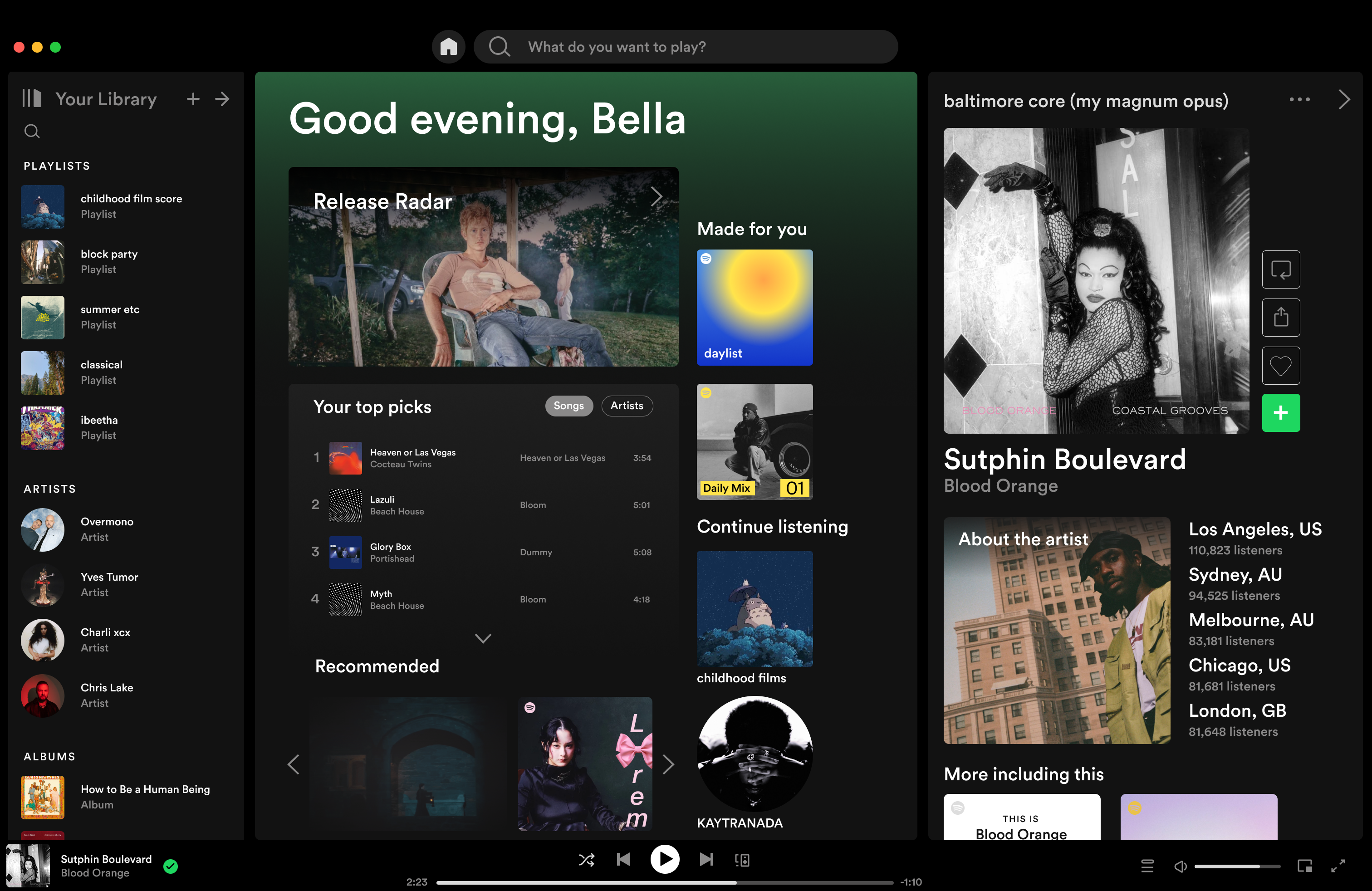
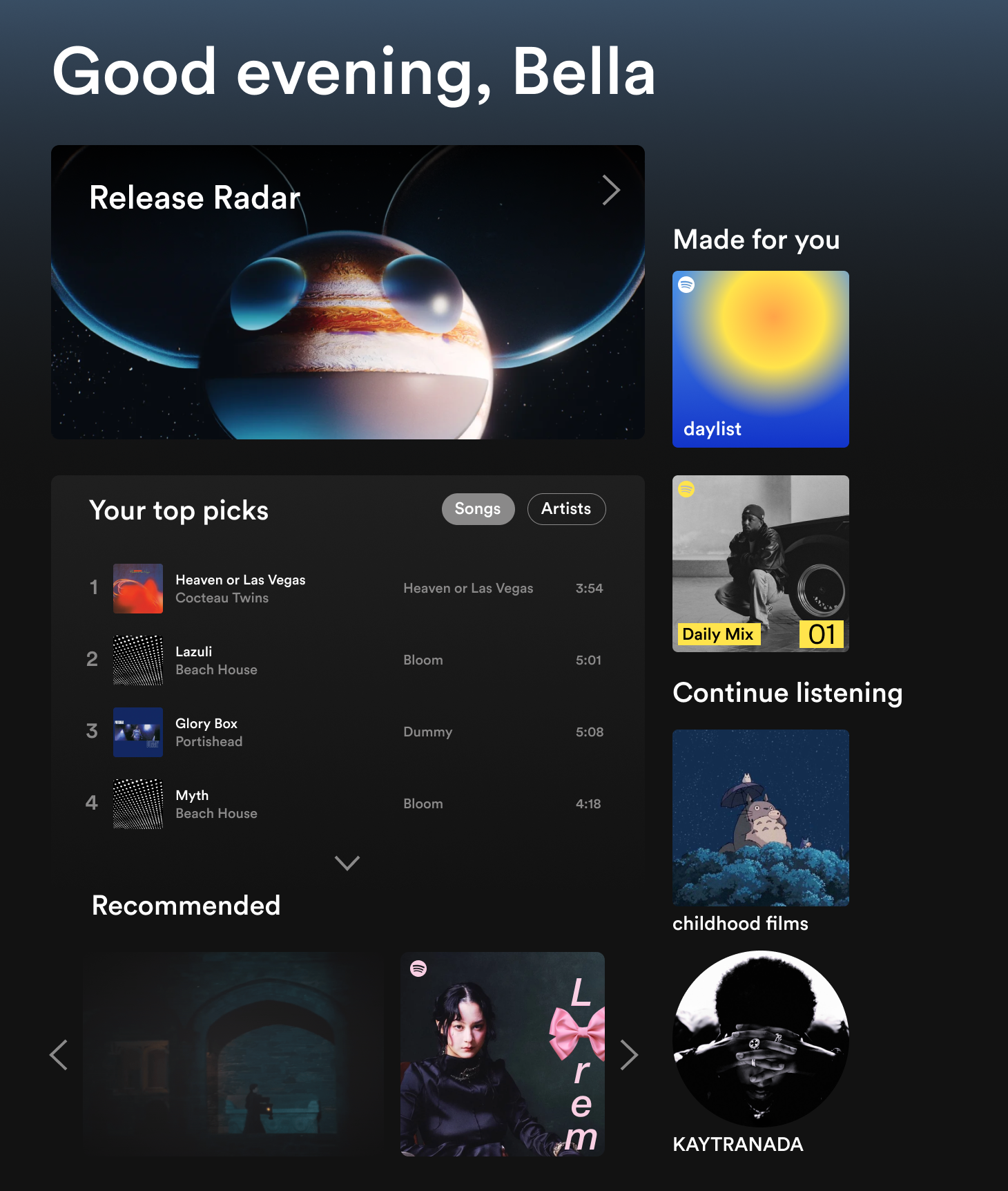
For a class design challenge, I chose to redesign the Spotify homescreen to address key usability flaws that impact daily navigation. The current interface feels overly busy, with redundant sections and an overengineered layout that makes it difficult to quickly find content. My goal was to simplify the experience, improving clarity and usability while maintaining Spotify's core functionality and visual identity.
Problem Statement
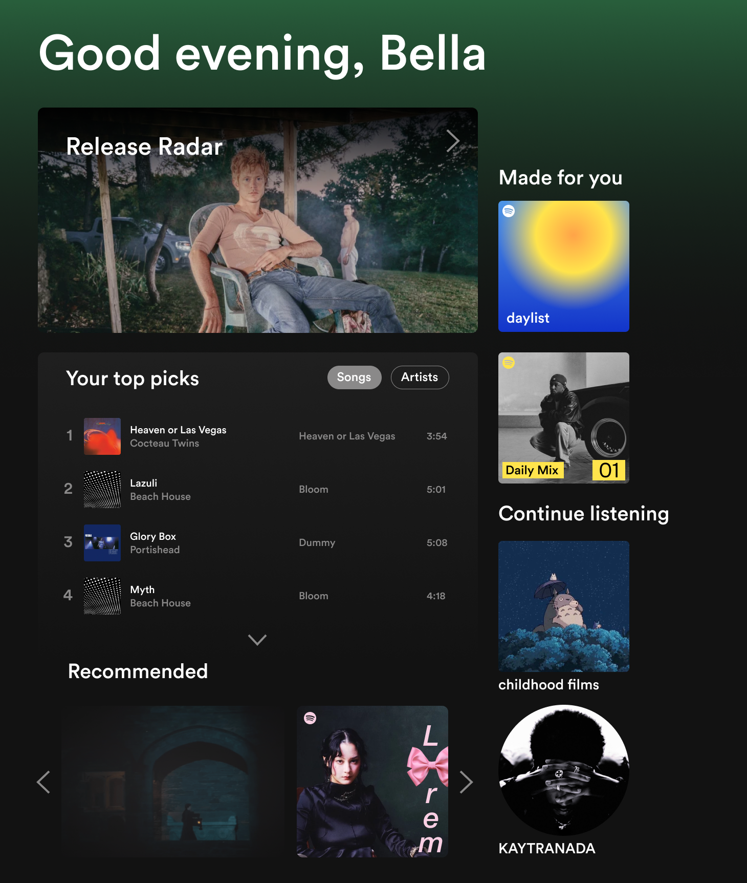
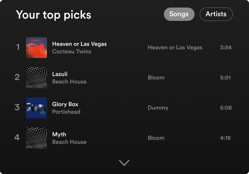
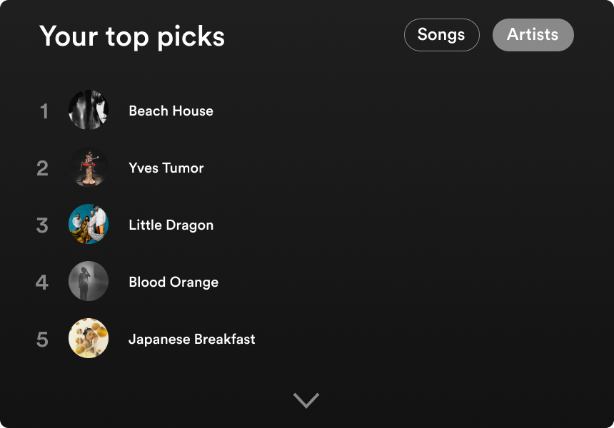
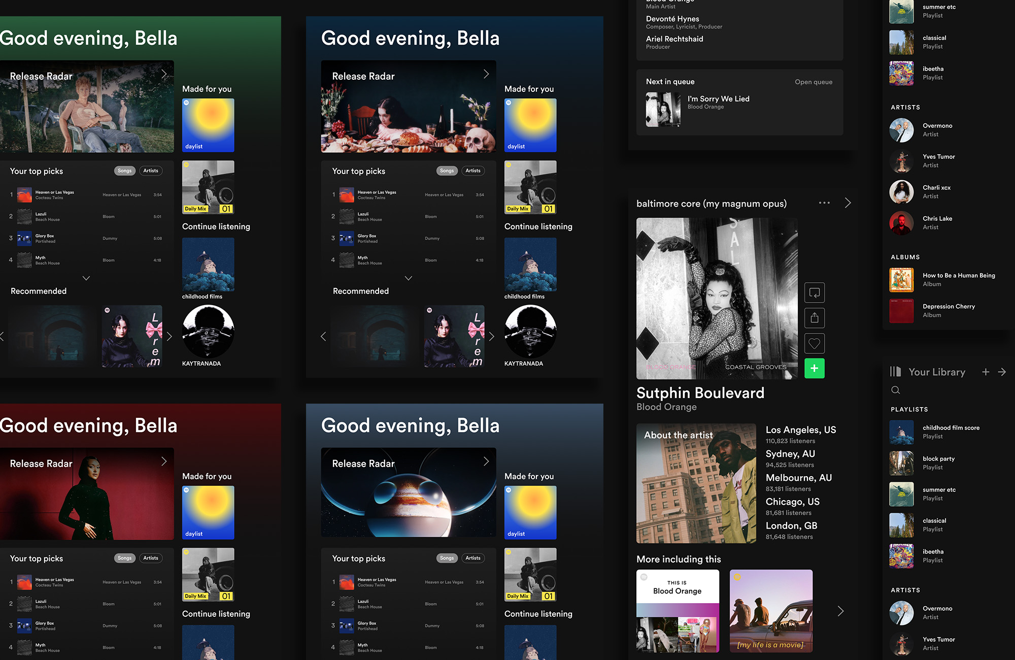
Spotify's home screen could better serve user needs with a more streamlined approach. It consists of three adjustable sections: a quick-view library (left), a currently-playing panel (right), and a central launchpad. While the left section functions well, the right panel primarily displays an album cover and an "about the artist" section, taking up significant space without offering much additional functionality. The central launchpad presents a wealth of content, including recommended artists, daily mixes, and popular Spotify playlists. However, the abundance of information can feel overwhelming, and the personalization could be more refined to better align with individual listening habits. A more balanced layout could enhance usability and content discovery.